
Fall is here, which also means fall culture is here, which means I have grievances.
Well, I have one personal grievance, in addition to the ones we all have. Yeah, pumpkin-spiced food is weird, and the $700 apple orchard experience is weird, and buying new pillows every season is weird. Fall is commercialized and latte-scented and all normal people regard the annual onslaught of velvet-tufted pumpkins with a wary eye.
My beef is with the font.
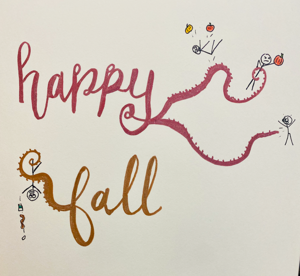
You know the one I’m talking about. The HAPPY FALL Y’ALL one. With the irregular lean and the swirly, pumpkin-vine tendrils for end serifs. It’s on t-shirts and mugs and candles and wreaths. Sometimes it says SWEATER WEATHER or AUTUMN LEAVES AND PUMPKINS PLEASE.
If you still can’t picture it, just swat your arm blindly out the nearest window. I guarantee you will make contact with at least one rustic porch decoration commanding you to be happy that the seasons are changing. Insisting that you embrace this annual reminder that life is transient and your own death is inevitable—with GLEE.
And it will be printed in this font.
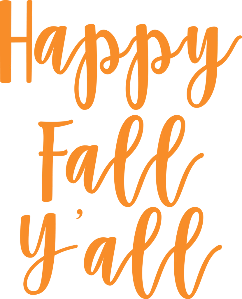
This is the font now synonymous with the business of fall and all its resplendent, quilted extraness, for reasons I cannot fathom. It’s hideous, is it not? The loops, my GOD the loops.
And then there’s the wild, unhinged stress on the downstrokes. It carries a faint scent of madness, as though a calligrapher has gotten drunk, grabbed the nearest chisel-tip Expo marker, and scribbled a fan letter to the British period actor she’s pined for since the early 2000s.
We’ve all been there, but that doesn’t mean we have to go making a fontrosity out of it.
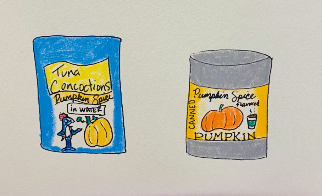
For some reason, this is the fall when I can’t take it anymore. I can’t look at that font, glaring as it does from every coffee cup and waffle-knit towel in Sur La Table, and glean any sort of enjoyment from the season. When did the letters become so aggressive? Tentacles trailing off the sides, italics pushing toward me like a close talker wafting its Salted Caramel Pumpkin breath across my face?
It is HOSTILE.
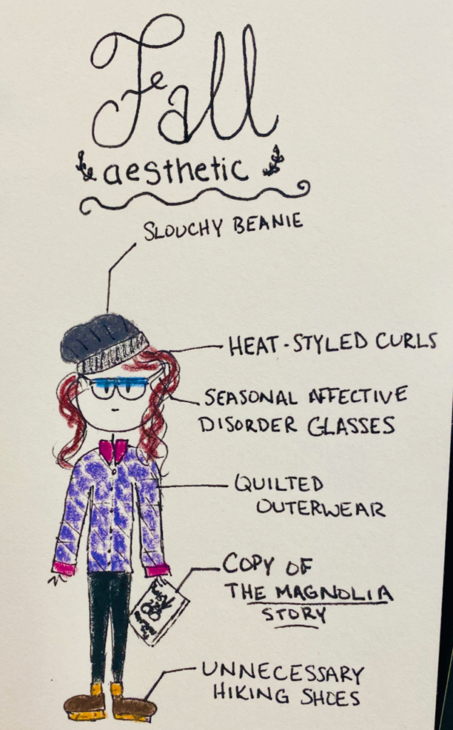
I suppose it’s not the font itself I hate so much as what it represents—a broad, tacky imitation of femininity I find offensive because it’s so damn ubiquitous. Must ALL the fall decor look like Fixer-Upper roams the earth as a sentient virus? Couldn’t you put a little Palatino Sans on something for a change?
Women are interesting and varied! We do not all want the same font, the same aesthetic, the same life. Yes, some women want to wear plaid shirts and have their eyeballs assaulted with slanty letters every time they walk into the house, but some women don’t, Target! Some women want to redecorate only every other presidential administration! Some women like linotypes! Some women wouldn’t put a lettered piece of decor on their wall if you waterboarded them!
Martha Stewart would never have that font in her kitchen, is what I’m trying to say.
Well, this year, I reject the font and all that it stands for. I don’t have to have a happy fall, y’all. This is America, and I will suffer from mild seasonal affective disorder every September for the rest of my life if I want.
Thank you for coming to my TED talk.
Lisa … quick, find your happy place and go there!!!